Server side NextJS rendering and Reduced Motion support for mobile
Part 1 - Core React Concepts
This article explores how a modern React + Next.js storefront leverages the newest React patterns and architecture to deliver an interactive, accessible, animation-rich ecommerce experience. Instead of discussing React in theory, we examine real production components:
- Root Layout
- Product Grid
- Quick View Modal
Each demonstrates modern React concepts including JSX, client/server boundaries, hooks, component composition, portals, context, animation orchestration, and accessibility-driven UI design. Before we dive in, lets take a minute to make sure we are all on the same page. React officially shifted its focus from Class components to Functional components on February 6, 2019, with the release of React 16.8.
Functional Components
Modern React shifted the paradigm from Class Components (which act like blueprints for objects) to Functional Components (which act like pure JavaScript functions). This isn't just a syntax preference; it changed the entire architecture of frontend development.
Summary Table: Class vs. Functional
| Feature | Class Components [OLD] | Functional Components [NEW] |
|---|---|---|
| State | this.state / this.setState | useState Hook |
| Logic Reuse | HOCs, Render Props | Custom Hooks |
| Lifecycle | componentDidMount, etc. | useEffect Hook |
| Complexity | High (due to this context) | Low (pure JavaScript functions) |
| Logic Grouping | Logic grouped by time (Lifecycle). | Logic grouped by concern (Feature). |
To illustrate the shift, let’s look at a common scenario: a component that tracks a window's width and manages a simple counter.
In the Class version, the logic for the window listener is split across three different lifecycle methods, making it hard to track. In the Functional version, useEffect keeps the "setup" and "cleanup" together.
LEGACY CLASS COMPONENT
import React, { Component } from 'react';
class ResizeCounter extends Component {
constructor(props) {
super(props);
this.state = { count: 0, width: window.innerWidth };
// Manual binding required for 'this'
this.handleResize = this.handleResize.bind(this);
}
componentDidMount() {
// Side effect setup
window.addEventListener('resize', this.handleResize);
document.title = Count: ${this.state.count};
}
componentDidUpdate(prevProps, prevState) {
// Check if count changed to update title
if (prevState.count !== this.state.count) {
document.title = Count: ${this.state.count};
}
}
componentWillUnmount() {
// Side effect cleanup
window.removeEventListener('resize', this.handleResize);
}
handleResize() {
this.setState({ width: window.innerWidth });
}
render() {
return (
<div>
<p>Window width: {this.state.width}</p>
<button onClick={() => this.setState({ count: this.state.count + 1 })}>
Increment: {this.state.count}
</button>
</div>
);
}
}
MODERN CLASS COMPONENT
import React, { useState, useEffect } from 'react';
const ResizeCounter = () => {
const [count, setCount] = useState(0);
const [width, setWidth] = useState(window.innerWidth);
// Concern 1: Window Resize Logic
useEffect(() => {
const handleResize = () => setWidth(window.innerWidth);
window.addEventListener('resize', handleResize);
// Cleanup is returned in the same block!
return () => window.removeEventListener('resize', handleResize);

}, []); // Empty array = run on mount only
// Concern 2: Document Title Logic
useEffect(() => {
document.title = Count: ${count};
}, [count]); // Runs only when count changes
return (
<div>
<p>Window width: {width}</p>
<button onClick={() => setCount(count + 1)}>
Increment: {count}
</button>
</div>
);
};
Part 2 — Root Layout: Server Components and Global Architecture
The Root Layout demonstrates modern React server-driven architecture
The Root Layout is more than just a wrapper around pages — it acts as the foundation that defines how rendering flows through the entire application. Instead of pushing everything to the client and letting the browser figure it out, the layout establishes a server-first pipeline where content is prepared, optimized, and streamed to users quickly.
In practice, this means the layout becomes responsible for global structure, shared UI, and performance decisions that affect every route in the app.
Server Component Structure
The layout is intentionally not marked with "use client", which means it runs as a Server Component by default. Most of the rendering work happens on the server before the browser ever sees the page.
This changes how you think about building interfaces. Instead of asking "how do I hydrate this later?", you start asking "does this even need to run on the client at all?"
Benefits:
- Reduced client-side JavaScript and smaller bundles
- Faster initial page loads and improved Core Web Vitals
- Streaming-friendly rendering for progressive content delivery
- Server-side data fetching without additional client requests
- Ability to keep sensitive logic and tokens off the client
- A stable application shell that loads instantly across routes
What the Root Layout Typically Owns
Because it runs on the server, the Root Layout becomes the ideal place for global concerns:
- Navigation and persistent layout structure
- Font loading and global styling
- Metadata, SEO tags, and document structure
- Theme setup and global providers that do not require client interactivity
- High-level data required across multiple pages
Real-World Impact on the Storefront
Using a server-driven Root Layout makes the storefront feel faster and more stable:
- Users see meaningful content immediately instead of a blank loading shell
- Layout shifts are reduced because structural HTML arrives early
- Hydration work is minimized since fewer components require client logic
- Navigation feels instant because the global shell is already rendered
Why This Matters in Modern React
Modern React encourages developers to move as much work as possible to the server while reserving the client for true interactivity. The Root Layout becomes the boundary where these decisions are made.
By keeping the layout server-first, the application gains:
- A consistent performance baseline
- Cleaner separation between server and client responsibilities
- Reduced complexity in interactive components
- A more scalable architectural foundation
Instead of being a passive container, the Root Layout becomes an active performance and architecture layer that helps the entire application stay fast, maintainable, and predictable.
Server Component Structure
The layout is not marked with "use client", meaning it runs as a server component.
Benefits:
- Reduced client-side JavaScript
- Faster page loads
- Streaming-friendly rendering
export default function RootLayout({ children }: { children: React.ReactNode }) {
// Children are passed into the layout:
<CartProvider>{children}</CartProvider>

}
This demonstrates React’s composition model — the layout provides global UI structure while individual pages inject their own content.
Context API for Global State
The CartProvider uses React Context to share cart state across the entire app.
Why this matters:
- Eliminates prop drilling
- Enables global reactive updates
- Keeps state centralized
Font Loading with React and Next.js
Fonts are defined declaratively:
const spaceGrotesk = Space_Grotesk({...});
Benefits:
- Automatic optimization
- Reduced layout shift
- Server-driven styling
Metadata as Structured UI Configuration
React components define metadata:
export const metadata: Metadata = { ... }
This allows the UI to remain declarative even at the document level.
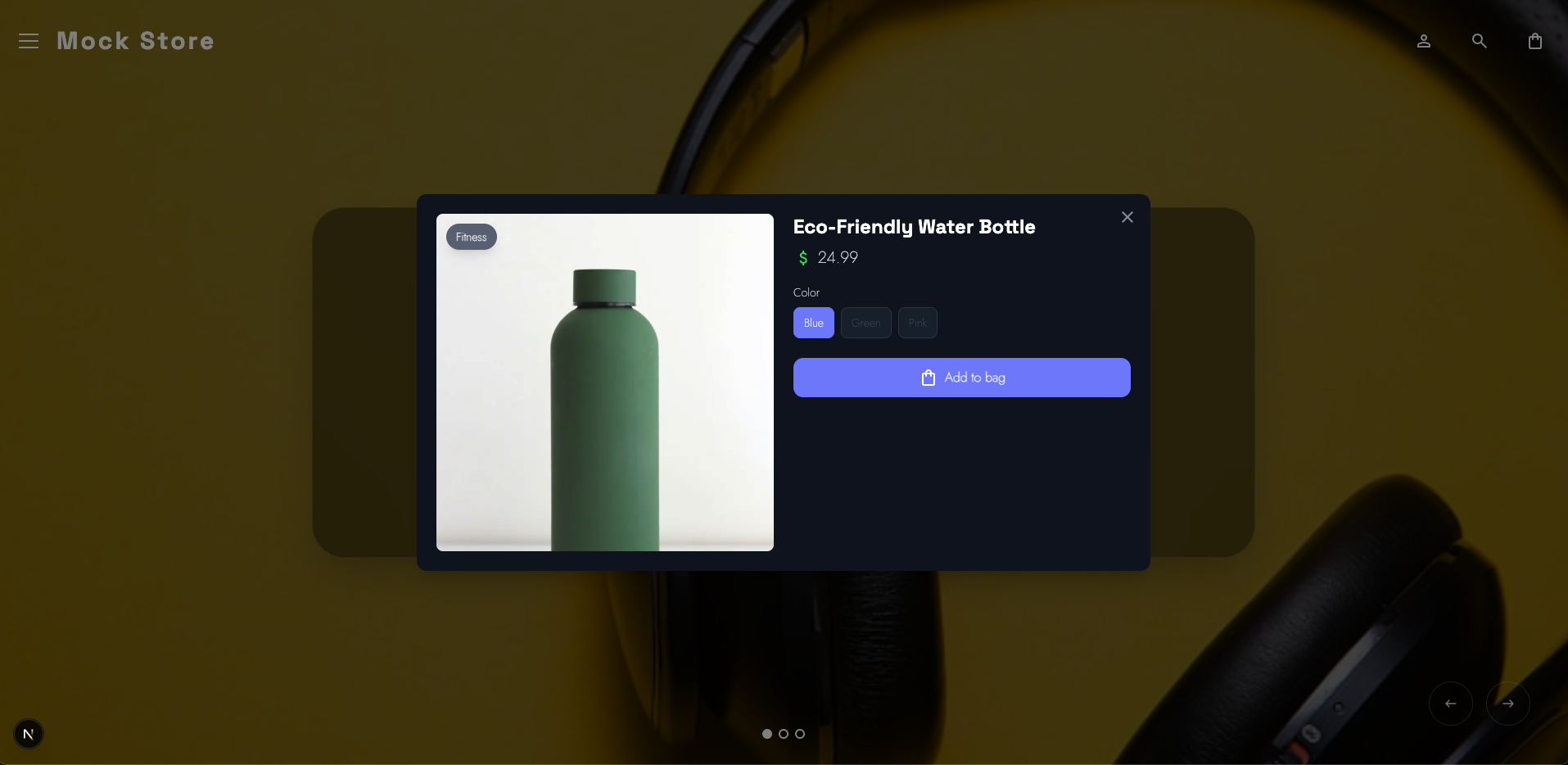
Part 3 — Quick View Modal: Advanced React Interaction Patterns
The QuickViewModal component is more than a UI container; it is the critical bridge between browsing and purchasing. In e-commerce, every millisecond of friction between a "Quick View" click and the "Add to Cart" button costs money. This component serves as the "heart and soul" of the application, designed specifically to walk the user down the path to a conversion with zero lag.
3A. Portals: Escaping the DOM Hierarchy
if (typeof document === "undefined") return null;
return createPortal(modal, document.body);
Why it matters for conversion: In complex storefront layouts, stacking contexts (z-index battles) can often cause modals to be clipped by parent containers or hidden behind sticky headers. By using createPortal, we teleport the modal to the very top of the document.body.
- The Result: Guaranteed visual priority. The "Call to Action" is never obscured by legacy layout constraints, ensuring the user's focus remains entirely on the product and the "Add to Cart" workflow.
3B. High-Fidelity Physics with Framer Motion
The modal utilizes AnimatePresence and motion to move away from rigid CSS transitions toward fluid, physics-based motion.
transition={{ layout: { type: "spring", damping: 25, stiffness: 300 } }}
- Spring Physics: Unlike standard linear easing, spring physics feel "snappy" and organic. It makes the UI feel responsive to the touch, which builds a sense of quality and trust.
- Layout Orchestration: The layout prop allows the modal to animate its size changes automatically if the product description expands or options change, preventing jarring layout shifts that can frustrate users.
3C. State-Driven Adaptive UI (Header Compaction)
The modal tracks its own internal scroll state to trigger a headerCompact mode.
const [headerCompact, setHeaderCompact] = useState(false);
// Triggered via onScroll={handleScroll} on the container
const handleScroll = (e) => {
if (e.currentTarget.scrollTop > 10) {
setHeaderCompact(true);
} else {
setHeaderCompact(false);
}
};
- Contextual Intelligence: As the user scrolls down to read reviews or details, the header shrinks. This maximizes the available "real estate" for the product content and the "Add to Cart" button, keeping the most important information front-and-center.
3D. Accessibility as a Conversion Tool
Accessibility is often mistaken for a "compliance" task, but in this modal, it is a performance feature that helps different types of users stay in the funnel.
- Focus Management: Through useRef, the component can programmatically move focus to the close button or the product title upon opening. This ensures keyboard users aren't "lost" in the background.
- Reduced Motion Support: ```javascript const [reduceMotion, setReduceMotion] = useState( () => typeof window !== "undefined" && window.matchMedia("(prefers-reduced-motion: reduce)").matches );
By respecting system preferences, we ensure that users prone to motion sickness have a comfortable experience, preventing them from bouncing off the site due to discomfort.
3E. Touch Optimization and Ergonomics
The mobile implementation is specifically tuned for the "thumb zone."
- Ergonomic Tap Targets: The mobile close button uses
touch-manipulationand amin-h-[44px](the industry standard for tap targets). - Responsive Positioning: Using
items-end sm:items-center, the modal slides up from the bottom on mobile (like a native sheet) but centers on desktop. This matches user expectations for each device, making the "Close" and "Add to Cart" actions feel native and intuitive.
Summary of Interaction Gains
| Feature | Technical Implementation | Impact on User |
|---|---|---|
| Instant Feel | Framer Motion Spring | Eliminates perceived lag; feels high-end. |
| Maximized Content | Scroll-driven headerCompact |
Keeps the product options visible longer. |
| Clean Exit | AnimatePresence |
Smooth exit prevents "flashing" or jarring jumps. |
| Zero Stacking Issues | React Portals | Prevents UI bugs where the modal is unclickable. |
By combining these patterns, the QuickViewModal creates a "slippery slope" that leads the user from interest to action with zero technical friction.
The QuickView Engine: Powering Premium Interactions
To build a storefront that feels "high-end," we move beyond basic HTML. By using the "use client" directive, we unlock the full suite of modern React capabilities: Hooks, Event Listeners, Physics Engines, and direct DOM Manipulation.
1. Reactive UI State (useState)
Instead of manually toggling CSS classes, we let state drive the visual experience.
const [headerCompact, setHeaderCompact] = useState(false);
- How it works: As the user scrolls through product details, the header dynamically shrinks.
- The Payoff: The UI feels alive and responsive. Logic remains declarative and easy to debug.
2. Smart Side Effects (useEffect)
We use useEffect to synchronize our component with the "outside world"—the browser itself.
useEffect(() => { window.addEventListener("keydown", handleEscape); return () => window.removeEventListener("keydown", handleEscape); }, [handleEscape]);
- Real-World Use: Handling "Esc" key closures, locking the background scroll when the modal is open, and detecting if a user prefers "Reduced Motion" at the system level.
- The Payoff: Predictable behavior that replaces messy, legacy lifecycle methods.
3. Surgical DOM Access (useRef)
Sometimes, you need to grab a specific element directly. useRef provides a "laser pointer" to the DOM.
const contentRef = useRef<HTMLDivElement>(null);
- The Mission: Primarily used for Focus Trapping. When the modal opens, we force the keyboard focus inside it.
- The Payoff: Seamless accessibility (WCAG) and flawless keyboard navigation.
4. Performance Optimization (useCallback)
In a high-traffic store, performance is profit. useCallback ensures our functions don't get "re-created" every time the screen updates.
const handleEscape = useCallback((e: KeyboardEvent) => {...}, []);
- The Payoff: Prevents expensive re-renders and keeps the application buttery smooth, even on low-end mobile devices.
5. Teleporting Content (createPortal)
Modals often get "trapped" inside parent containers with weird CSS rules. Portals allow us to "teleport" the modal to the very top of the HTML structure.
return createPortal(modal, document.body);
- The Payoff: No more z-index wars. The modal always sits on top, escaping the "layout stacking context" of the rest of the page.
6. Meaningful Motion (AnimatePresence)
Standard "on/off" visibility is jarring. We use AnimatePresence to manage the lifecycle of a component as it enters and leaves the page.
{isOpen && ( <motion.div> ... </motion.div> )}
- The Payoff: Professional-grade "exit animations." The modal doesn't just vanish; it fades or slides away gracefully, maintaining the user's spatial awareness.
BONUS POINTS | Featured Slider: Architecture in Motion
The FeaturedSlider isn't just a carousel; it’s a masterclass in combining third-party power (like Swiper.js) with React’s declarative architecture. It handles complex state—active indices, touch gestures, and autoplay—while keeping the UI perfectly synced with the underlying product data.
Without going into to much detail, the swiper is awesome because the library that we are using is awesome:
import { Swiper, SwiperSlide } from "swiper/react";
import { Navigation, Pagination, Autoplay, EffectFade } from "swiper/modules";
import { motion, AnimatePresence } from "motion/react";
import "swiper/css";
import "swiper/css/navigation";
import "swiper/css/pagination";
import "swiper/css/effect-fade";
Part 4 — Product Grid: Component Composition and Declarative Lists
The product grid showcases how React handles scalable product interfaces.
Component Composition
The grid renders reusable ProductCard components:
products.map(product => <ProductCard ... />)
Benefits:
- Modular UI
- Independent component logic
- Scalable architecture
- Event Prefetching and Interaction Handling
onMouseEnter={handlePrefetch}
onFocus={handlePrefetch}
React’s event system enables performance optimizations such as prefetching.
Derived UI Values
Instead of state:
const category = getPrimaryCategory(product);
Derived data ensures:
- Deterministic rendering
- Minimal re-renders
- Cleaner logic
- Accessibility via Refs
- Refs allow focus restoration when modals close.
Benefits:
- Improved keyboard navigation
- Screen reader compatibility
- WCAG compliance
- Why Modern React Enables a Truly Great Storefront]
This storefront demonstrates how modern React architecture supports:
- Server-first rendering for performance
- Client-side interactivity where needed
- Declarative animation systems
- Accessibility-driven UI design
- Component-based scalability
- Predictable data flow
- Reactive UI updates
By combining hooks, context, portals, JSX, and compositional design patterns, the application achieves a level of responsiveness and maintainability that traditional frontend architectures struggle to match.
Final Thoughts
Modern React is no longer just a UI library — it is a full architectural paradigm for building interactive applications.
This storefront leverages:
- Server components for performance
- Client components for interactivity
- Hooks for state and lifecycle control
- Context for global data
- Portals for layered UI
- Declarative animations
- Accessible interaction models
The result is a highly responsive, animation-rich, and accessible Shopify storefront that demonstrates how the latest React features can power production-grade ecommerce experiences.
There are still a number of features and elements in the example project that we havent yet covered in the article. In future sections, we will explore:
- Data fetching strategies with GraphQL
- Motion-driven microinteractions
- Accessibility-first animation systems
- Performance optimizations using React’s rendering model
- View transitions and shared element animations
Together, these patterns show how modern React enables developers to build storefronts that feel fast, polished, and deeply interactive without sacrificing maintainability or accessibility.
So make sure you subscribe to the RSS Feed, Our X.com Profile and /or Our LinkedIn Profile to stay up to date and read the next part in this series when it comes out.


Comments
Add Comment
All Comments
// NO_COMMENTS_IN_BUFFER
Establish initialization protocol by creating the baseline entry trace.
System Moderation Interceptor is ON for this communication hub. All user transmission vectors must clear access protocol filtration approvals before broadcasting logs live to public network arrays.