
Iterating through the various versions
The Wild Ride of Logo Design
Logo design is tough. Like, pull-your-hair-out, question-your-life-choices tough. Almost no one nails it on the first try. Case in point: that Cracker Barrel logo rebrand. [Links to recent Cracker Barrel logo news]. Yikes—talk about a design disaster that sparked a firestorm of hot takes!
The internet went wild with gossip and snarky Reddit threads tearing it apart, and honestly, they had a point. It’s practically a textbook example of what not to do. I’ve seen other missteps too—like slapping a bunch of circles on a logo and calling it “deeply meaningful.” Nope, not here. Instead, let’s take a fun stroll through the ups and downs of designing a logo that actually works.
Kicking Things Off
Let’s fast-forward through the early chaos. I sifted through a gazillion fonts—serifs, sans-serifs, you name it—before landing on something decent. Here’s where I started:
It’s clean, sure, but it’s also... boring. This logo could belong to a coffee shop, a law firm, or a dog groomer. It needed something to give it personality. The font was a solid foundation, but the battle was far from won.
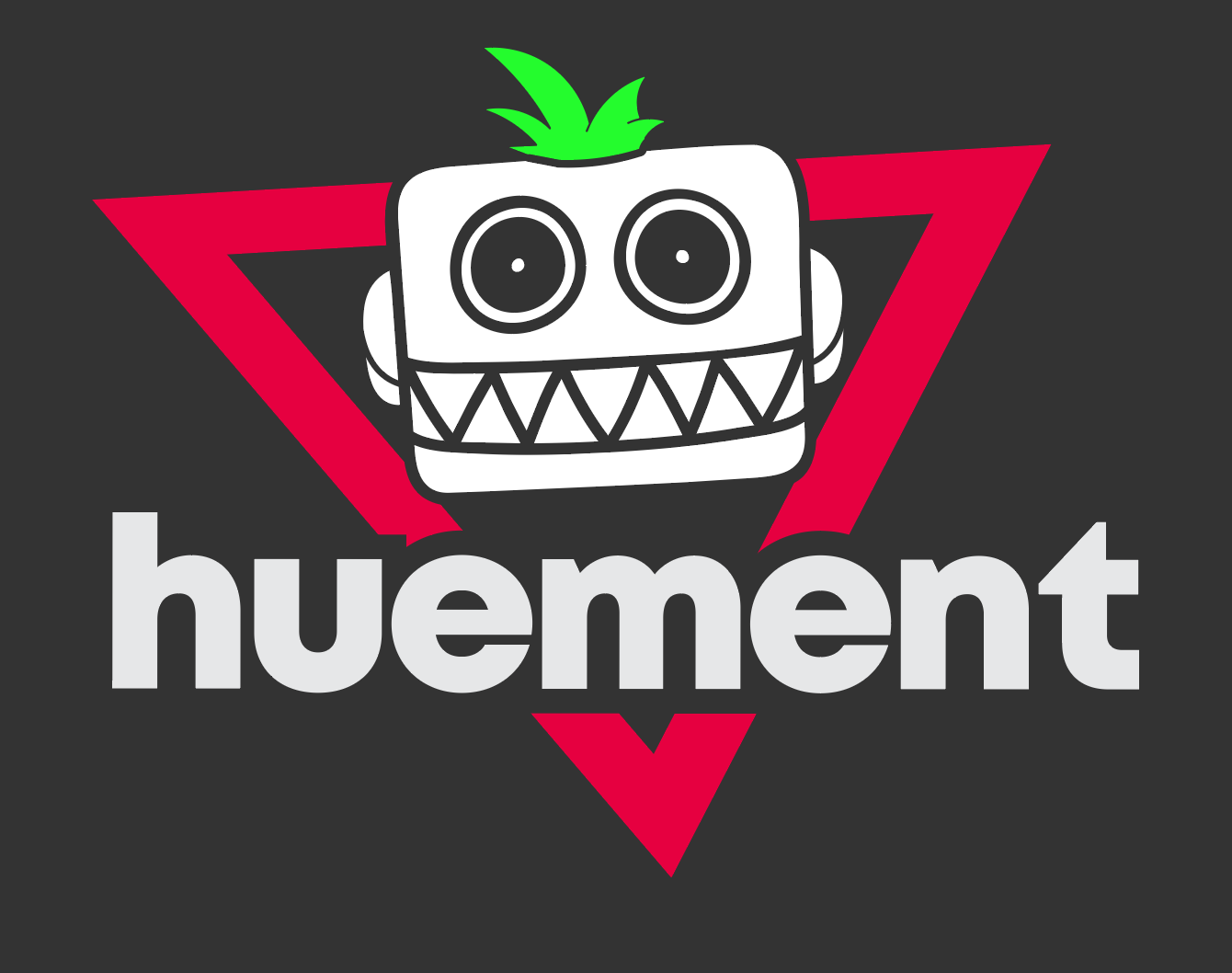
Enter the Robot Era
Since we’re a tech-focused company, a robot mascot felt like a no-brainer. Mascots are awesome for shouting your brand’s vibe loud and clear. Check out this bad boy:
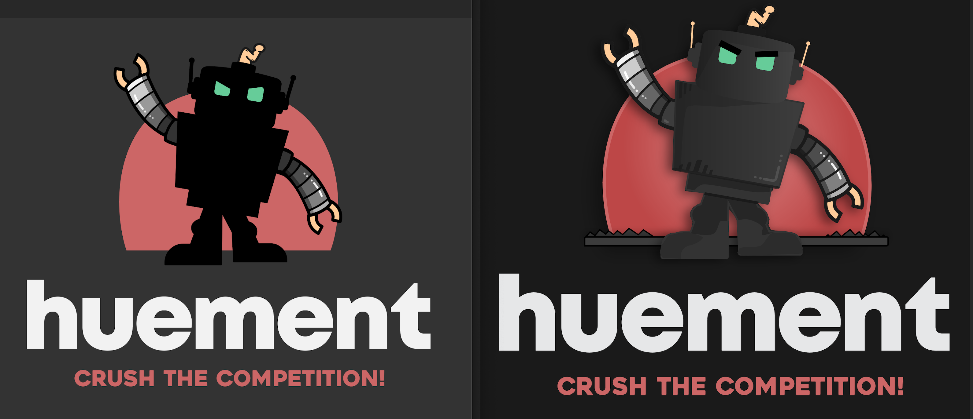
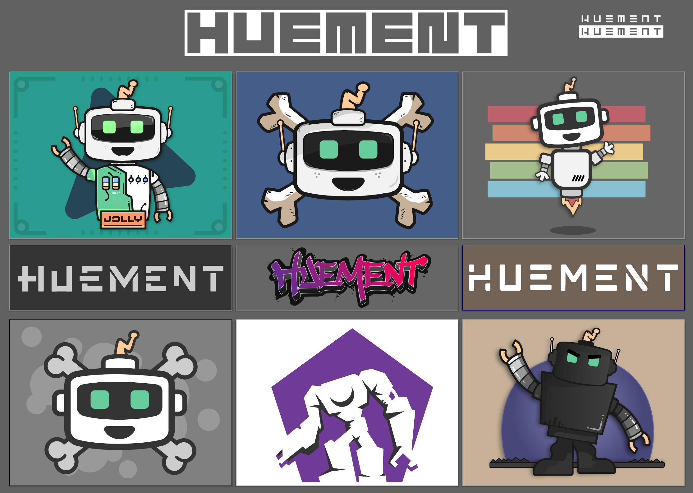
Cool for a sci-fi flick, but a giant robot screams “we’re here to crush the competition,” which wasn’t quite the vibe we wanted. We tinkered with a few robot iterations, but they were too intense. That said, we didn’t ditch the idea entirely—meet our “Jolly Robot,” now happily answering FAQs on our site:
Aliens, Anyone?
Next, I pivoted to something totally different: a UFO. For a hot minute, this was the one. Simple, versatile, and perfect for print, web, or mobile. Plus, who’s out here using flying saucers? (Missed opportunity, world!)
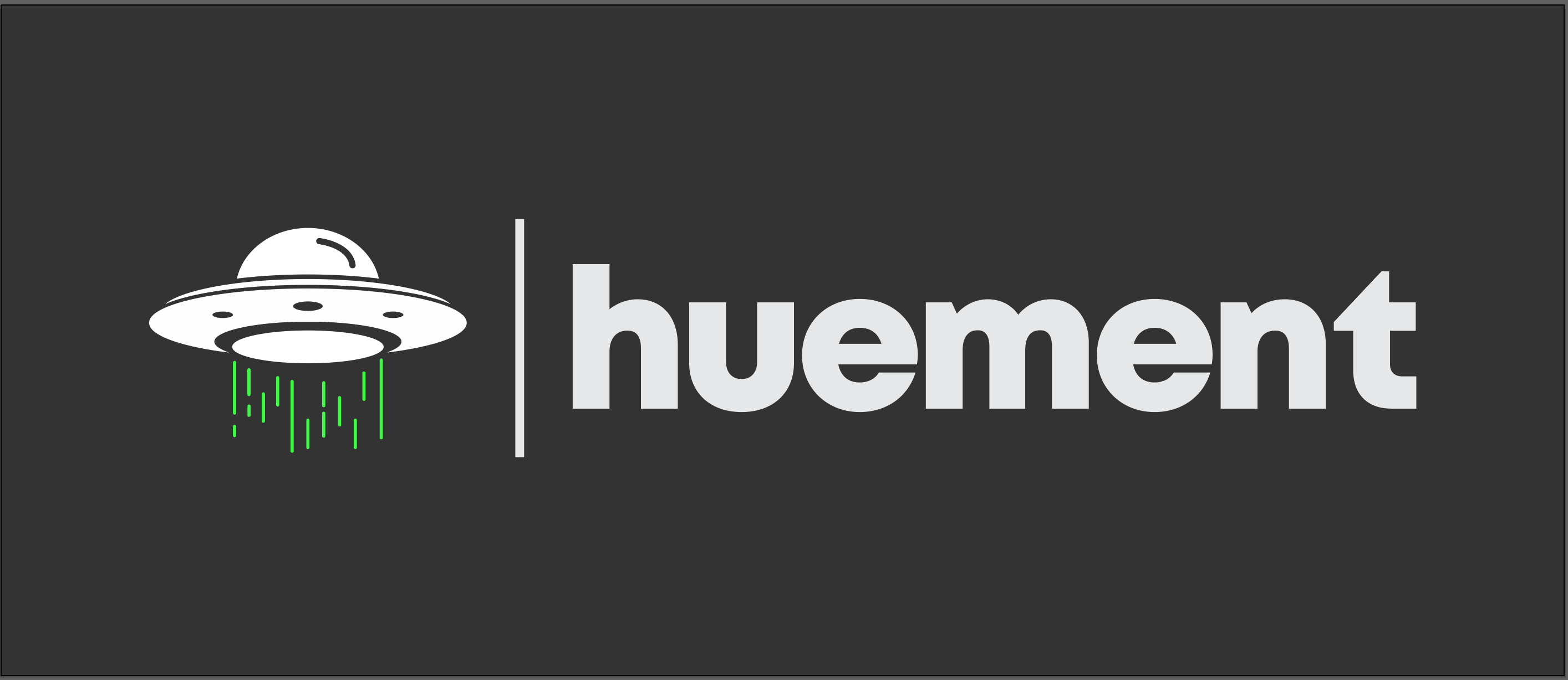
I even spiced it up with a catchy, alliterative slogan:
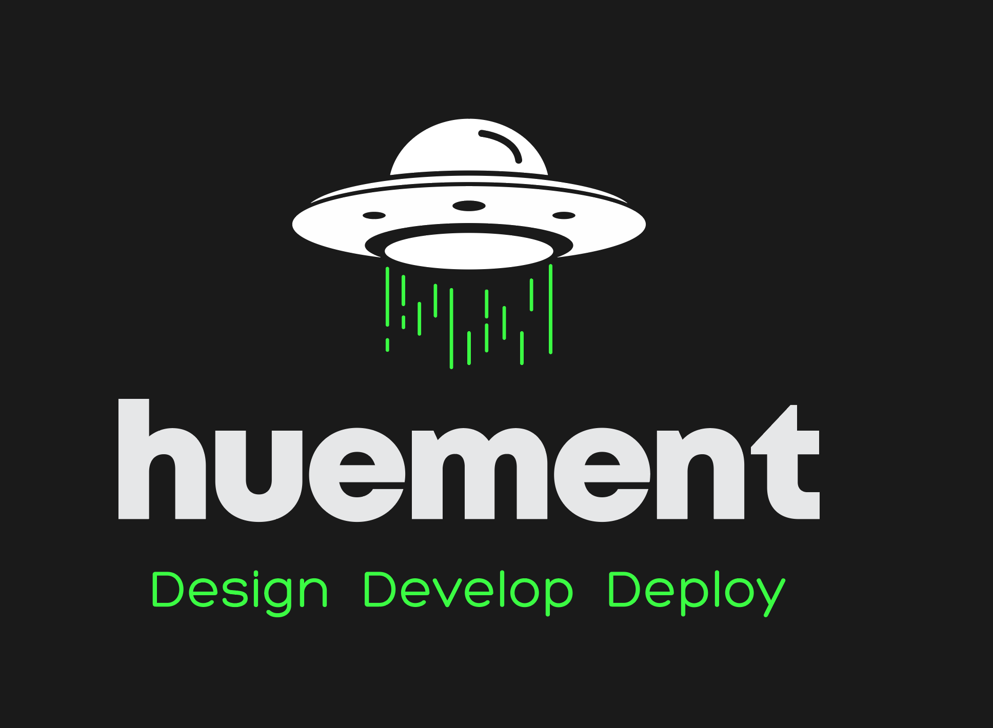
Love it, right? Well, almost. The slogan screamed “tech company,” but without it, the UFO just said... “space vibes.” We’re not selling intergalactic joyrides or alien abductions, so this one got parked.
Monogram Madness
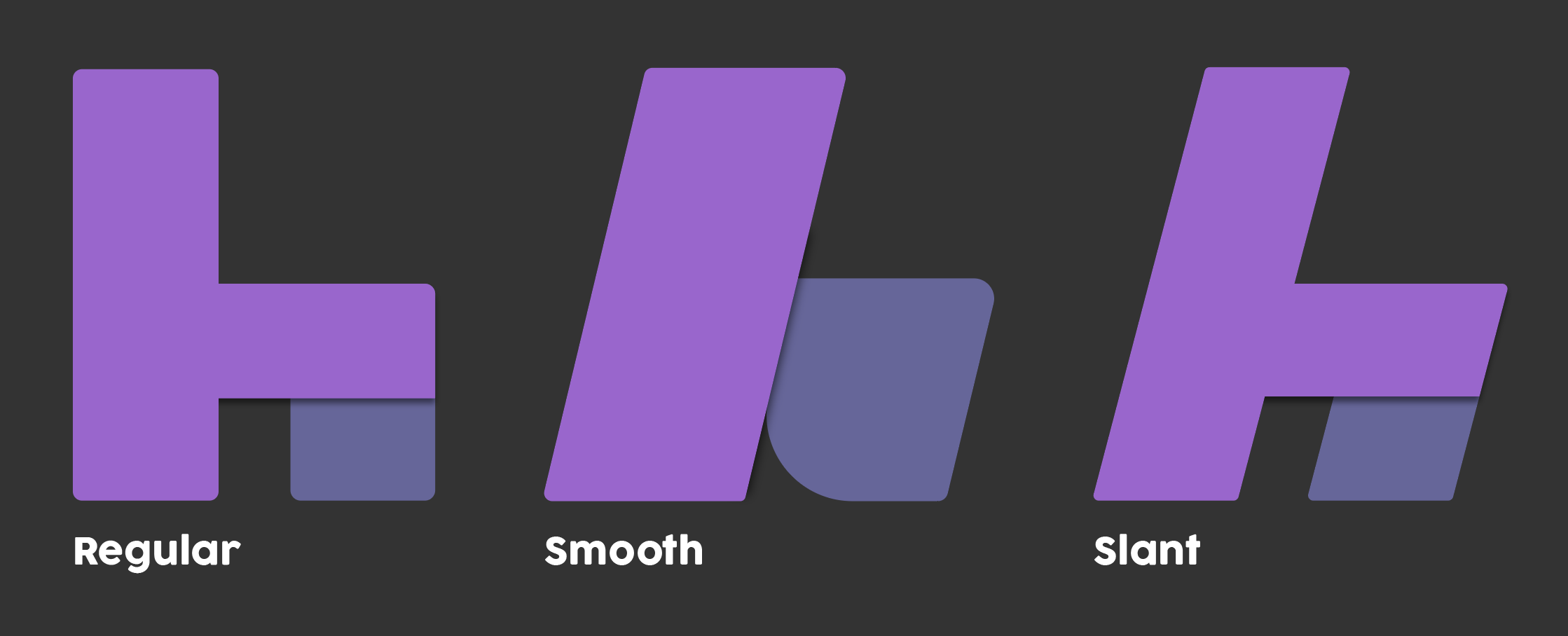
When in doubt, monograms are a safe bet. A single letter can be sleek and timeless when you’re stuck. Here’s where I started:
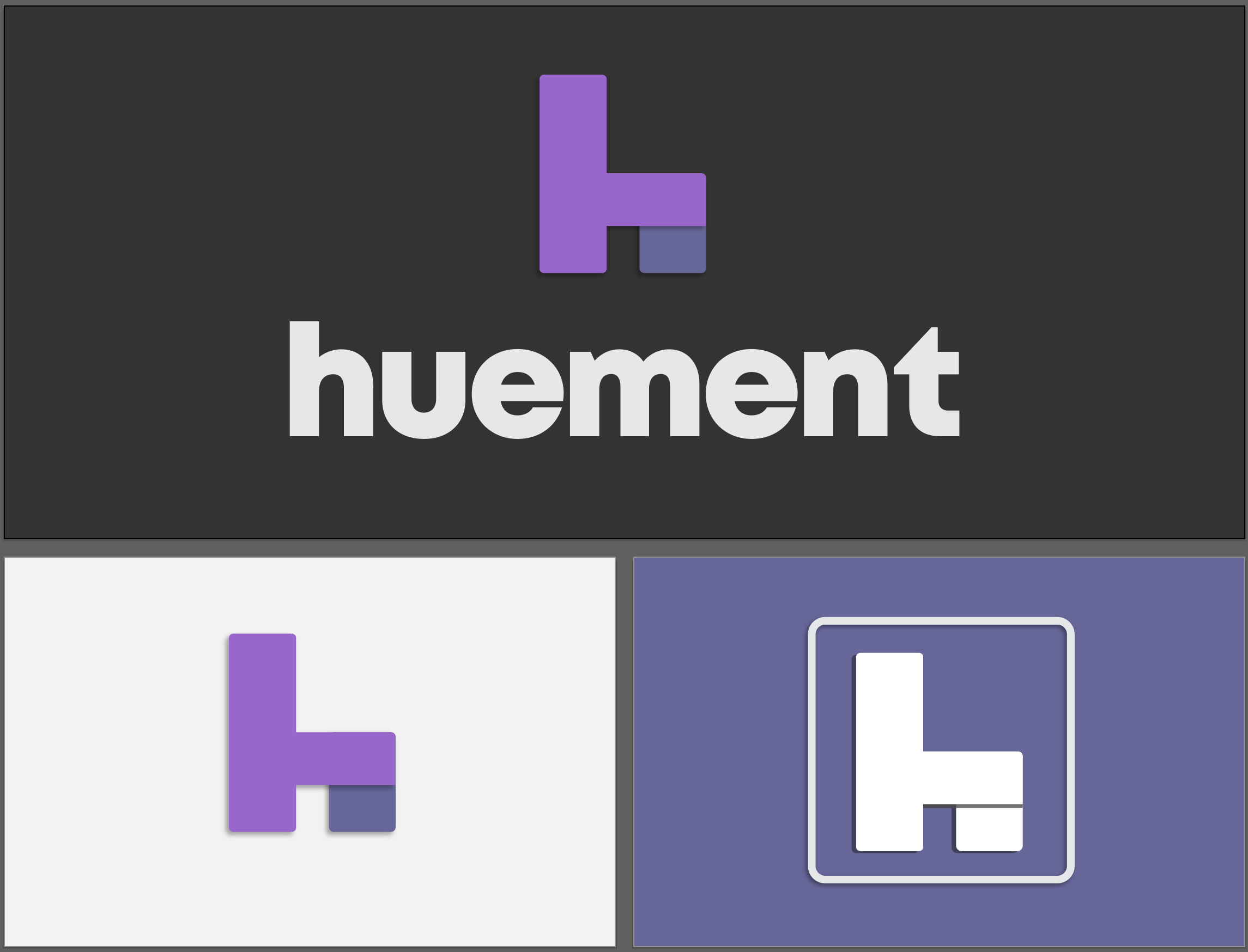
I played with some variants, tweaking shapes and adding flair:
Then I sprinkled in some circles and squares to hint at data, networks, and techy goodness:
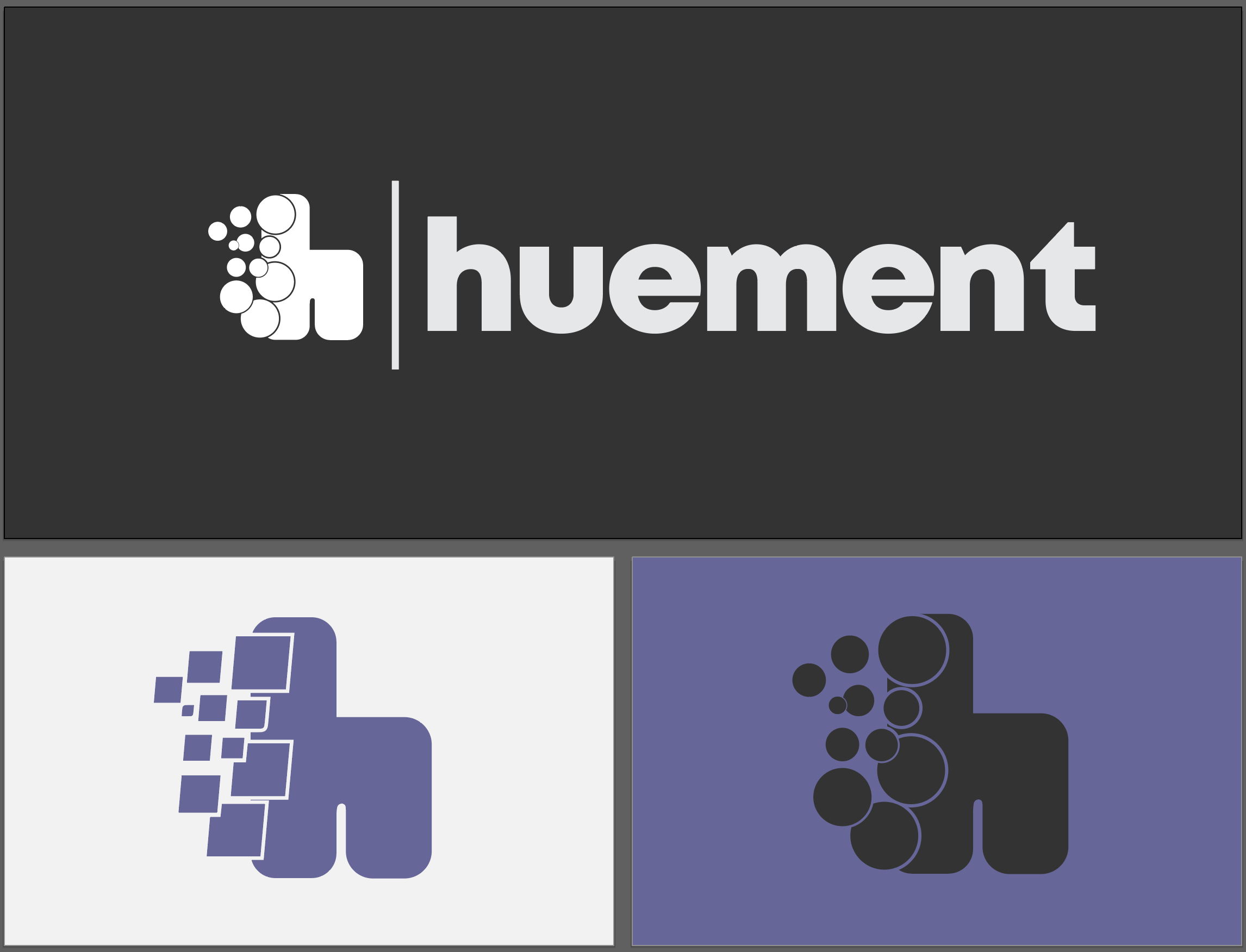
It was clean and modern, but—confession time—it was also meh. Too safe, too forgettable. Monograms work great for design studios aiming for understated elegance, but I wanted something with a bit more oomph.
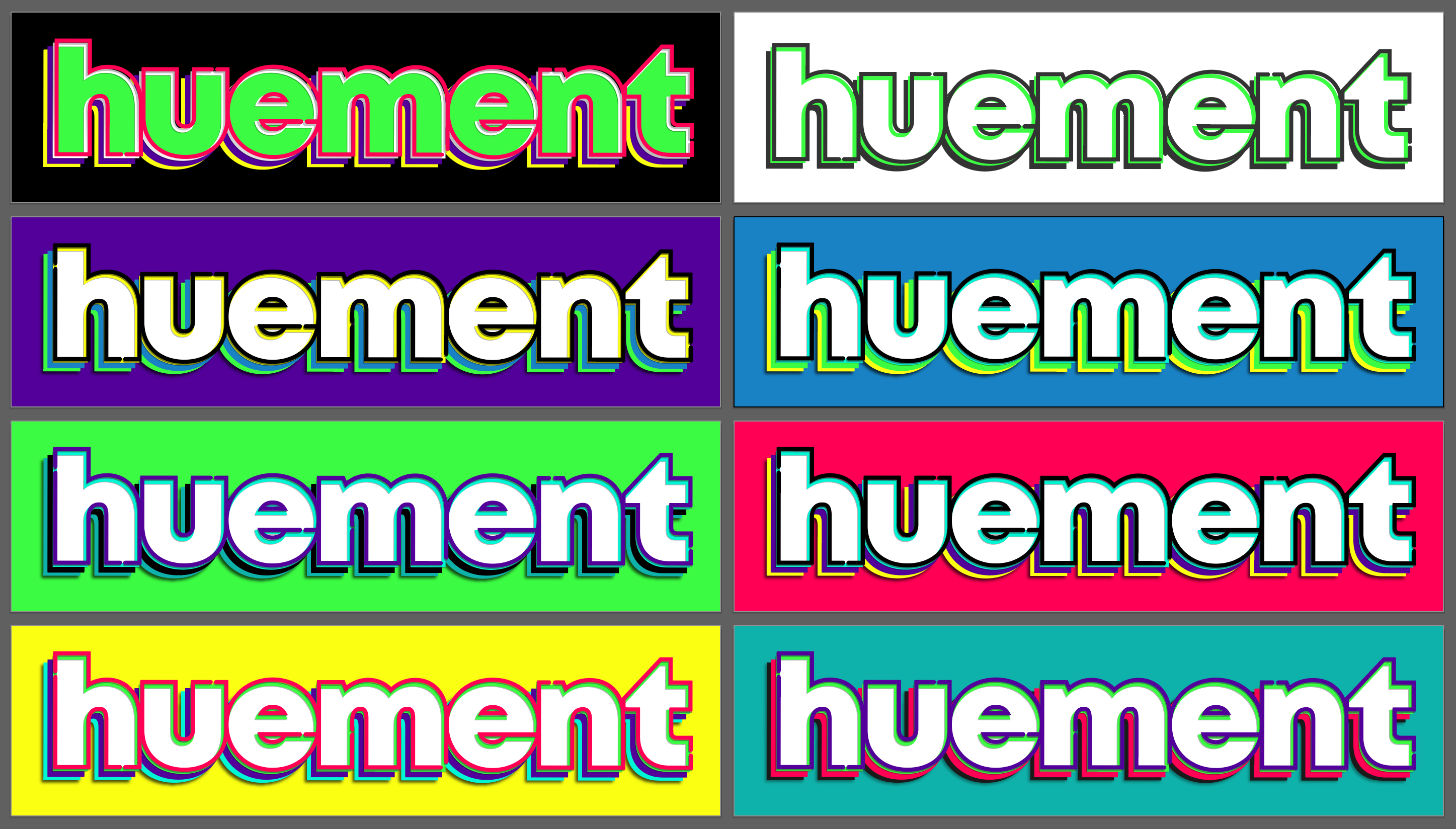
Okay, Maybe Too Much Oomph
Speaking of oomph, I briefly went off the rails with this wild one:
Yeah, it’s a vibe, but it’s giving “energy drink ad” more than “tech company.” Time for a breather.
Stepping Back
With the logo still not clicking, I shifted gears to work on other design tasks—website layouts, color schemes, you name it:
Sometimes, stepping away is the best way to let ideas simmer.
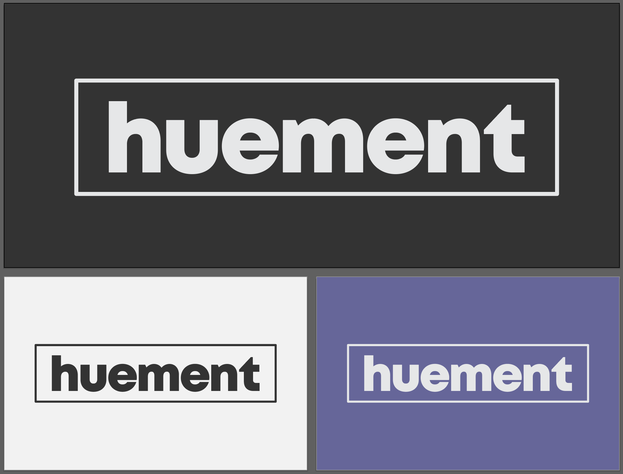
Nailing the Final Logo
Finally, as other design pieces fell into place, the logo started to come together. Here’s where the magic happened:
![]()
A few tweaks later, and boom—we had a winner:
And that’s the story of how the Huement logo was born! It was a wild ride, but we got there. Got thoughts, questions, or need help with your own logo? Drop a comment below or hit me up—I’d love to chat!


Comments
Add Comment
All Comments
// NO_COMMENTS_IN_BUFFER
Establish initialization protocol by creating the baseline entry trace.
System Moderation Interceptor is ON for this communication hub. All user transmission vectors must clear access protocol filtration approvals before broadcasting logs live to public network arrays.