Theming & Customization
Theming & Customization
UltraViolet Pro features a powerful theming system and comprehensive customization options. This guide covers everything from setting up build tools to creating custom themes with dark/light mode support.
What You'll Learn
- Setup: Install Node.js, npm, and development tools
- Theme System: Dark/Light mode, RTL support, custom themes
- Customization: Modify colors, fonts, layouts, and components
- Build Process: Use Vite to compile SCSS and JavaScript
- Advanced: Create multiple themes, optimize performance
What You Need
To customize UltraViolet Pro, you'll need:
- Node.js (v18 or higher)
- npm (comes with Node.js)
- A code editor (VS Code, Sublime Text, etc.)
- Basic knowledge of SCSS/CSS
Quick Start Setup
Step 1: Install Node.js
If you don't have Node.js installed:
Mac
# Using Homebrew
brew install node

# Or download from nodejs.org
Windows
# Download installer from nodejs.org
# Or use Chocolatey
choco install nodejs
Linux
# Ubuntu/Debian
sudo apt install nodejs npm

# Fedora
sudo dnf install nodejs npm
Verify installation:
node --version  # Should be v18 or higher
npm --version   # Should be v8 or higher
Step 2: Install Dependencies
Navigate to your UltraViolet Pro folder and install packages:
cd /path/to/ultraviolet-pro
npm install
This will install:
- Vite - Build tool and dev server
- Sass - SCSS compiler
- Bootstrap - CSS framework
- Alpine.js - JavaScript framework
- PostCSS - CSS processor
- And more - All required dependencies
Wait for the installation to complete. This may take a few minutes.
Step 3: Start Development Server
Run the development server with hot reload:
npm run devYou should see:
VITE v5.x.x  ready in XXX ms

➜  Local:   http://localhost:5173/
➜  Network: use --host to expose
Open http://localhost:5173/ in your browser to see your dashboard with live reloading!
Project Structure
Important Folders
ultraviolet-pro/
├── resources/
│   ├── sass/                    # SCSS source files
│   │   ├── _ultraviolet-tokens.scss    # Color & style variables
│   │   ├── _ultraviolet-theme.scss        # CSS variables (light/dark)
│   │   ├── _ultraviolet-components.scss        # Core component styles
│   │   ├── admin-vertical.scss     # Main vertical layout
│   │   ├── admin-horizontal.scss   # Main horizontal layout
│   │   ├── _admin-shared.scss           # Shared admin styles
│   │   └── _hui.scss                    # HUI utility framework
│   │
│   └── js/                      # JavaScript source files
│       ├── admin-static.js             # Main admin JavaScript
│       ├── admin.ts             # TypeScript entry
│       └── modules/             # JavaScript modules
│
├── public/                      # Compiled output (auto-generated)
│   └── assets/                  # Built CSS/JS files
│
├── package.json                 # Dependencies and scripts
├── vite.config.js              # Vite configuration
├── postcss.config.js           # PostCSS config
└── tsconfig.json               # TypeScript config
Understanding the Theme System
UltraViolet Pro uses a sophisticated theming system that combines:
- CSS Custom Properties (Variables) for dynamic theme switching
- SCSS Variables for compile-time customization
- Bootstrap 5.3.8 color mode system (
[data-bs-theme]attribute) - 100+ Semantic Variables for comprehensive component coverage
Switching Themes
Toggle between light and dark themes using the settings panel:
- Click the gear icon (⚙️) in the top-right header
- Toggle "Dark / Light Mode" switch
- Theme changes instantly with smooth animation
- Preference is saved automatically to localStorage
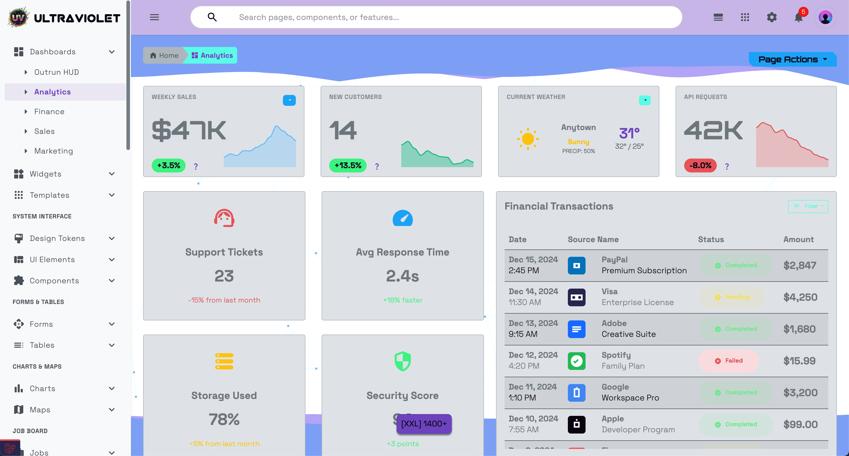
UltraViolet Pro in Light Mode - Clean, professional appearance for daytime use
Programmatic Theme Control
// Switch to light theme
document.documentElement.setAttribute('data-bs-theme', 'light');

// Switch to dark theme
document.documentElement.setAttribute('data-bs-theme', 'dark');

// Get current theme
const currentTheme = document.documentElement.getAttribute('data-bs-theme');
console.log(currentTheme); // 'dark' or 'light'
Development Workflow
Running the Dev Server
npm run devThis starts Vite's development server with:
- Hot Module Replacement (HMR) - Changes appear instantly
- Fast refresh - No full page reload needed
- Source maps - Easy debugging
- Auto-compilation - SCSS/JS compile on save
Making Changes
- Edit SCSS files in
resources/sass/ - Edit JS files in
resources/js/ - Save the file
- Browser updates automatically - See changes instantly!
Building for Production
When you're ready to deploy:
npm run buildThis creates optimized files:
- Minified CSS - Smaller file sizes
- Minified JavaScript - Compressed and optimized
- Cache busting - Unique filenames for each build
- Production ready - Optimized for performance
Output is in public/assets/:
public/assets/
├── app-[hash].css     # Your compiled styles
└── app-[hash].js      # Your compiled scripts
CSS Variables Reference
Layout Variables
Core layout and structure colors:
/* Body & Main Layout */
--body-bg              /* Main body background color */
--body-bg-2            /* Secondary background (surfaces, panels) */
--body-color           /* Default text color */

/* Header & Navigation */
--action-bar-bg        /* Top header/action bar background */
--action-bar-color     /* Top header text color */
--sidebar-bg           /* Sidebar background */
--sidebar-color        /* Sidebar default text color */
Text Variables
--text-primary         /* Primary text color (high emphasis) */
--text-secondary       /* Secondary text color (medium emphasis) */
--text-muted           /* Muted text color (low emphasis) */
--text-accent          /* Accent color for highlights */
--text-link            /* Hyperlink color */
Background Variables
--bg-card              /* Card background */
--bg-card-hover        /* Card hover state background */
--bg-surface           /* Surface/panel background */
--bg-surface-2         /* Alternate surface background */
--bg-overlay           /* Overlay/modal backdrop */
--bg-glass             /* Glass effect background */
--bg-light-accent      /* Light accent background */
Border Variables
--border-primary       /* Primary border color */
--border-secondary     /* Secondary border color */
--border-accent        /* Accent border color */
Component Variables
Sidebar Menu
--sidebar-menu-item-color          /* Menu item text color */
--sidebar-menu-item-hover-bg       /* Menu item hover background */
--sidebar-menu-item-hover-color    /* Menu item hover text color */
--sidebar-menu-item-active-bg      /* Active menu item background */
--sidebar-menu-item-active-color   /* Active menu item text color */
--sidebar-submenu-bg               /* Submenu background */
Forms
--form-control-bg              /* Input/textarea background */
--form-control-border          /* Input/textarea border */
--form-control-color           /* Input/textarea text color */
--form-control-placeholder     /* Placeholder text color */
--chip-bg                      /* Chip/tag background */
--chip-color                   /* Chip/tag text color */
Tables
--table-border-color           /* Table border color */
--table-customer-name-color    /* Customer name column color */
--table-product-title-color    /* Product title color */
--table-product-tag-bg         /* Product tag background */
HUD Components
--hud-text-cyan                /* HUD cyan text color */
--hud-text-magenta             /* HUD magenta text color */
--hud-card-bg                  /* HUD card background */
--hud-card-border              /* HUD card border */
--hud-card-hover-bg            /* HUD card hover background */
--hud-metric-label-color       /* HUD metric label color */
Special Effects
--glass-bg                     /* Glass morphism background */
--glass-border                 /* Glass morphism border */
--glow-cyan                    /* Cyan glow effect color */
--glow-magenta                 /* Magenta glow effect color */
SCSS Variables Reference
Core Color Variables
Primary color palette defined in resources/sass/_ultraviolet-tokens.scss:
// Grayscale
$white: #fff;
$gray-100: #f8f9fa;
$gray-600: #6c757d;
$gray-900: #170229;
$black: #000;

// Brand Colors
$blue: #1ba2f6;
$purple: #6f42c1;
$pink: #ea39b8;
$green: #3cf281;
$cyan: #32fbe2;

// Theme Colors
$primary: $purple;
$secondary: $cyan;
$success: $green;
$info: $blue;
$warning: #ffc107;
$danger: #e44c55;
Layout Variables
// Dashboard Layout
$action-bar-color: #d5d5d5;
$action-bar-bg: #0a0a0a;
$main-menu-bg: $gray-900;
$body-bg: #1a0933;
$body-color: $white;
Typography Variables
// Font Families
$font-family-sans-serif: "Space Grotesk", -apple-system, BlinkMacSystemFont, "Segoe UI", Roboto;
$font-family-monospaced: "Ubuntu Sans Mono";
$font-family-headings: "Orbitron";

// Font Weights
$headings-font-weight: 700;
Component Variables
// Cards
$card-border-width: 2px;
$card-spacer-y: 1.75rem;
$card-border-color: rgba($white, .2);

// Forms
$input-bg: $gray-800;
$input-border-color: $gray-600;
$input-focus-border-color: $primary;

// Borders
$border-radius: .25rem;
$border-radius-lg: .5rem;
Customization Methods
Method 1: Modify SCSS Variables
The easiest way to customize is to change variables in resources/sass/_ultraviolet-tokens.scss:
// resources/sass/_ultraviolet-tokens.scss

// ============================================
// BRAND COLORS - Change these!
// ============================================

$blue: #1ba2f6;        // Change to your brand blue
$purple: #6f42c1;      // Change to your brand purple
$green: #3cf281;       // Change to your brand green

// Theme Colors
$primary: $purple;     // Main brand color
$secondary: $cyan;     // Secondary brand color

// ============================================
// LAYOUT COLORS
// ============================================

$body-bg: #1a0933;           // Main background
$body-color: #ffffff;         // Main text color
$action-bar-bg: #0a0a0a;     // Top header background
$main-menu-bg: #170229;      // Sidebar background

// ============================================
// TYPOGRAPHY
// ============================================

$font-family-sans-serif: "Space Grotesk", -apple-system, BlinkMacSystemFont, "Segoe UI", Roboto;
$font-family-headings: "Orbitron";
$headings-font-weight: 700;

// ============================================
// COMPONENTS
// ============================================

$border-radius: .25rem;      // Corner radius
$card-border-width: 2px;
Save the file and the dev server will automatically recompile!
Method 2: Customize CSS Variables
Modify runtime theme variables in resources/sass/_ultraviolet-theme.scss:
// resources/sass/_ultraviolet-theme.scss

[data-bs-theme="dark"] {
  // Customize dark theme
  --body-bg: #0a1929;           // Change dark background
  --text-primary: #e7edf3;      // Change text color
  --bg-card: rgba(19, 47, 76, 0.6);  // Change card background

  // Change sidebar colors
  --sidebar-bg: #001e3c;
  --sidebar-menu-item-active-bg: rgba(59, 158, 255, 0.2);
}

[data-bs-theme="light"] {
  // Customize light theme
  --body-bg: #f8f9fa;
  --text-primary: #212529;
  --bg-card: #ffffff;

  --sidebar-bg: #ffffff;
  --sidebar-menu-item-active-bg: rgba(111, 66, 193, 0.1);
}
Method 3: Create Custom SCSS Files
Add your own custom styles:
// Create: resources/sass/_custom.scss

.my-custom-card {
  background: linear-gradient(135deg, #667eea 0%, #764ba2 100%);
  border: none;
  border-radius: 15px;
  box-shadow: 0 10px 30px rgba(102, 126, 234, 0.3);

  .card-title {
    color: white;
    font-weight: 700;
  }
}

.stat-card {
  background: var(--bg-card);
  border: 1px solid var(--border-primary);
  border-radius: 10px;
  padding: 20px;

  .stat-value {
    font-size: 2rem;
    font-weight: 700;
    color: var(--text-accent);
  }

  .stat-label {
    font-size: 0.875rem;
    color: var(--text-muted);
    text-transform: uppercase;
  }
}
Then import it in your main SCSS file:
// resources/sass/admin-vertical.scss

@import 'ultraviolet-tokens';
@import 'ultraviolet-theme';
@import 'custom';  // Add your custom styles
Common Customizations
Change Primary Color
// resources/sass/_ultraviolet-tokens.scss

// Change from purple to blue
$primary: #007bff;  // Bootstrap blue
// or
$primary: #1ba2f6;  // UltraViolet blue
// or
$primary: #ff6b6b;  // Custom coral red
Change Font
// resources/sass/_ultraviolet-tokens.scss

// Change main font
$font-family-sans-serif: "Inter", -apple-system, BlinkMacSystemFont, "Segoe UI", Roboto;

// Change heading font
$font-family-headings: "Poppins";

// Then add to your HTML <head>:
<link href="https://fonts.googleapis.com/css2?family=Inter:wght@300;400;500;600;700&display=swap" rel="stylesheet">
Change Sidebar Background
// resources/sass/_ultraviolet-theme.scss

[data-bs-theme="dark"] {
  --sidebar-bg: #1a1a2e;  // Dark navy
}

[data-bs-theme="light"] {
  --sidebar-bg: #2c3e50;  // Dark slate for contrast
}
Customize Dark/Light Toggle
// resources/js/admin-static.js

function enhancedThemeToggle() {
  const toggle = document.getElementById('admin-dark-mode-switch');

  toggle.addEventListener('change', function() {
    const theme = this.checked ? 'dark' : 'light';

    // Add transition class
    document.documentElement.classList.add('theme-transitioning');

    // Switch theme
    document.documentElement.setAttribute('data-bs-theme', theme);

    // Save preference
    localStorage.setItem('theme-preference', theme);

    // Remove transition class after animation
    setTimeout(() => {
      document.documentElement.classList.remove('theme-transitioning');
    }, 300);

    console.log(`Theme switched to: ${theme}`);
  });
}
Customizing JavaScript
Modifying Existing Scripts
Edit resources/js/admin-static.js or resources/js/admin.ts:
// resources/js/admin-static.js

// Add your custom JavaScript
document.addEventListener('DOMContentLoaded', function() {

  // Your custom code here
  console.log('Custom script loaded!');

  // Example: Add click handler to custom buttons
  document.querySelectorAll('.my-custom-button').forEach(button => {
    button.addEventListener('click', function() {
      alert('Custom button clicked!');
    });
  });

});
Adding New JavaScript Modules
Create modular JavaScript:
// resources/js/modules/myFeature.js

export function initMyFeature() {
  console.log('My feature initialized');

  // Your feature code
}

export function doSomething() {
  return 'Something done!';
}
Import in main file:
// resources/js/admin-static.js

import { initMyFeature } from './modules/myFeature.js';

document.addEventListener('DOMContentLoaded', function() {
  initMyFeature();
});
Creating Custom Themes
Method 1: Create a New Theme Variant
Create a custom theme alongside dark and light:
Step 1: Define CSS variables in resources/sass/_ultraviolet-theme.scss:
[data-bs-theme="midnight"] {
  // Layout - Deep blue palette
  --body-bg: #0a1929;
  --body-bg-2: #132f4c;
  --body-color: #e7edf3;
  --action-bar-bg: #001e3c;
  --sidebar-bg: #001e3c;

  // Text - Light blues and whites
  --text-primary: #e7edf3;
  --text-secondary: #7fa8c9;
  --text-muted: #4f7396;
  --text-accent: #3b9eff;

  // Backgrounds - Layered blues
  --bg-card: rgba(19, 47, 76, 0.6);
  --bg-card-hover: rgba(19, 47, 76, 0.8);
  --bg-surface: #132f4c;

  // Borders - Subtle blue tints
  --border-primary: rgba(59, 158, 255, 0.3);
  --border-secondary: rgba(59, 158, 255, 0.15);

  // Components - Sidebar
  --sidebar-menu-item-color: #7fa8c9;
  --sidebar-menu-item-hover-bg: rgba(59, 158, 255, 0.15);
  --sidebar-menu-item-active-bg: rgba(59, 158, 255, 0.2);

  // Forms
  --form-control-bg: #0a1929;
  --form-control-border: #1e4976;
  --form-control-color: #e7edf3;

  // Add all other variables...
}
Step 2: Add theme switcher UI:
<div class="form-group mb-3">
    <label for="theme-selector" class="form-label">Theme</label>
    <select id="theme-selector" class="form-select">
        <option value="dark">Dark (Default)</option>
        <option value="light">Light</option>
        <option value="midnight">Midnight Blue</option>
    </select>
</div>
Step 3: Update JavaScript:
// In resources/js/admin-static.js

const themeSelector = document.getElementById('theme-selector');
if (themeSelector) {
  const applyTheme = (theme) => {
    document.documentElement.classList.add('theme-transitioning');
    document.documentElement.setAttribute('data-bs-theme', theme);
    localStorage.setItem('theme-preference', theme);

    setTimeout(() => {
      document.documentElement.classList.remove('theme-transitioning');
    }, 300);
  };

  // Load saved theme
  const savedTheme = localStorage.getItem('theme-preference') || 'dark';
  themeSelector.value = savedTheme;
  applyTheme(savedTheme);

  // Listen for changes
  themeSelector.addEventListener('change', (e) => {
    applyTheme(e.target.value);
  });
}
Step 4: Compile & Test:
# Compile assets
npm run build

# Or in development
npm run dev

# Test in browser
document.documentElement.setAttribute('data-bs-theme', 'midnight');
Method 2: Override Specific Components
Target specific components without changing global theme:
[data-bs-theme="dark"] {
  .card.my-custom-card {
    background: linear-gradient(135deg, #667eea 0%, #764ba2 100%);
    border: none;
    box-shadow: 0 10px 30px rgba(102, 126, 234, 0.3);
  }

  .btn-custom {
    background: #f093fb;
    color: #000;

    &:hover {
      background: #4facfe;
    }
  }
}

[data-bs-theme="light"] {
  .card.my-custom-card {
    background: #ffffff;
    border: 2px solid #667eea;
    box-shadow: 0 4px 6px rgba(0, 0, 0, 0.1);
  }

  .btn-custom {
    background: #667eea;
    color: #fff;

    &:hover {
      background: #5568d3;
    }
  }
}
Method 3: Create Multiple Theme Files
Create separate SCSS files for different themes:
// resources/sass/theme-blue.scss
@import 'ultraviolet-tokens';

// Override variables
$primary: #007bff;
$secondary: #6c757d;

@import 'ultraviolet-components';
Add to vite.config.js:
input: [
    'resources/sass/admin-vertical.scss',
    'resources/sass/theme-blue.scss',
    'resources/js/admin.ts',
],
Build and use:
<link rel="stylesheet" href="./assets/theme-blue.css">Package.json Scripts
Available npm scripts:
{
  "scripts": {
    "dev": "vite",              // Start dev server
    "build": "vite build",       // Build for production
    "preview": "vite preview"    // Preview production build
  }
}
Development
npm run dev- Starts development server
- Enables hot module replacement
- Source maps for debugging
Production Build
npm run build- Minifies CSS and JavaScript
- Optimizes assets
- Generates cache-busting filenames
- Creates source maps
Preview Production Build
npm run preview- Serves the production build locally
- Test before deploying
Vite Configuration
The build process is configured in vite.config.js:
import { defineConfig } from 'vite';
import laravel from 'laravel-vite-plugin';

export default defineConfig({
    plugins: [
        laravel({
            input: [
                'resources/sass/admin-vertical.scss',
                'resources/sass/admin-horizontal.scss',
                'resources/js/admin.ts',
            ],
            refresh: true,
        }),
    ],
    build: {
        outDir: 'public/build',
        manifest: true,
    },
});
Customizing Vite
Add more entry points:
input: [
    'resources/sass/admin-vertical.scss',
    'resources/sass/admin-horizontal.scss',
    'resources/sass/custom-theme.scss',  // Your custom theme
    'resources/js/admin.ts',
    'resources/js/custom.js',             // Your custom JS
],
Advanced Customization
Theme-Aware JavaScript
Listen to theme changes and update components:
// Listen for theme changes
window.addEventListener('themeChanged', (event) => {
  const { theme, isDark } = event.detail;

  // Update ApexCharts colors
  if (window.myChart) {
    myChart.updateOptions({
      theme: {
        mode: theme
      },
      colors: isDark ?
        ['#32fbe2', '#ea39b8', '#3cf281'] :
        ['#6f42c1', '#1ba2f6', '#3cf281']
    });
  }
});
Responsive Theme Adjustments
// Mobile-specific theme adjustments
@media (max-width: 768px) {
  [data-bs-theme="dark"] {
    --body-bg: #0d0d0d;
    --text-primary: #ffffff;
  }

  [data-bs-theme="light"] {
    --body-bg: #fafafa;
    --text-primary: #333333;
  }
}
Adding PostCSS Plugins
Edit postcss.config.js:
module.exports = {
  plugins: [
    require('autoprefixer'),
    require('cssnano')({
      preset: 'default',
    }),
  ],
};
System Preference Detection
Respect user's OS preference:
// Automatic system preference detection
const getSystemPreference = () => {
  if (window.matchMedia && window.matchMedia('(prefers-color-scheme: dark)').matches) {
    return 'dark';
  }
  return 'light';
};

// Auto-switch when system preference changes
window.matchMedia('(prefers-color-scheme: dark)').addEventListener('change', (e) => {
  const newTheme = e.matches ? 'dark' : 'light';
  document.documentElement.setAttribute('data-bs-theme', newTheme);
});
Priority Order:
- Saved User Preference (localStorage
theme-preference) - System Preference (
prefers-color-schememedia query) - Default Theme (dark mode)
Best Practices
1. Use Semantic Variable Names
// ❌ Bad - not descriptive
--color-1: #ffffff;
--bg-2: #000000;

// ✅ Good - semantic meaning
--text-primary: #ffffff;
--bg-card: #000000;
2. Maintain Contrast Ratios
Ensure WCAG 2.1 compliance:
// ✅ Good contrast (4.5:1 minimum for normal text)
--body-bg: #0a1929;
--text-primary: #ffffff;  // 18.7:1 ratio

// ❌ Poor contrast (below 4.5:1)
--body-bg: #cccccc;
--text-primary: #999999;  // 2.1:1 ratio - fails WCAG
3. Test Both Themes
Always test your custom styles in both themes:
// Quick test function
function testThemes() {
  const themes = ['dark', 'light'];
  let index = 0;

  setInterval(() => {
    document.documentElement.setAttribute('data-bs-theme', themes[index]);
    console.log(`Testing ${themes[index]} theme`);
    index = (index + 1) % themes.length;
  }, 3000);
}
4. Keep Variables Organized
Group related variables:
// ============================================
// COLORS
// ============================================
$primary: #6f42c1;
$secondary: #32fbe2;

// ============================================
// TYPOGRAPHY
// ============================================
$font-size-base: 1rem;
$font-weight-bold: 700;

// ============================================
// SPACING
// ============================================
$spacer: 1rem;
5. Comment Your Changes
// Custom brand colors for client XYZ
$primary: #007bff;  // Client's brand blue
$secondary: #28a745;  // Client's brand green

// Increased for better readability per client request
$font-size-base: 1.125rem;
6. Version Control
Don't commit built files:
# .gitignore
/public/build
/public/assets
/public/hot
/node_modules
Commit source files:
resources/sass/resources/js/package.jsonvite.config.js
Troubleshooting
npm install fails
Clear cache and retry:
npm cache clean --force
rm -rf node_modules package-lock.json
npm install
Vite server won't start
Check port availability:
# Port 5173 might be in use
# Vite will automatically try next available port
# Or specify a different port:
npm run dev -- --port 3000
Changes not appearing
Hard refresh browser:
- Mac:
Cmd + Shift + R - Windows:
Ctrl + Shift + R
Clear Vite cache:
rm -rf node_modules/.vite
npm run dev
SCSS compilation errors
Check syntax:
// ❌ Missing semicolon
$primary: #007bff

// ✅ Correct
$primary: #007bff;

// ❌ Missing closing brace
.my-class {
  color: red;

// ✅ Correct
.my-class {
  color: red;
}
Theme Not Switching
Check the data-bs-theme attribute:
console.log(document.documentElement.getAttribute('data-bs-theme'));Verify localStorage:
console.log(localStorage.getItem('theme-preference'));Check if variable is defined:
// In browser console
const styles = getComputedStyle(document.documentElement);
console.log(styles.getPropertyValue('--body-bg'));
Production build fails
Check for errors:
npm run build
# Read error output carefully
Increase Node memory if needed:
NODE_OPTIONS="--max_old_space_size=4096" npm run buildDeployment
After Building
-
Run production build:
npm run build -
Files are generated in:
public/assets/ ├── app-[hash].css └── app-[hash].js -
Upload to your server:
- Upload
public/assets/folder - Upload your modified HTML files
- Ensure asset paths in HTML match your server structure
- Upload
HTML Integration
Update asset references in your HTML if needed:
<!-- Development (Vite dev server) -->
<link rel="stylesheet" >

<!-- Production (built files) -->
<link rel="stylesheet" href="./assets/app-abc123.css">
Accessibility
Ensure Sufficient Contrast
[data-bs-theme="dark"] {
  // Minimum 4.5:1 for normal text
  --body-bg: #000000;      // Background
  --text-primary: #ffffff;  // Text (21:1 ratio ✅)
}

[data-bs-theme="light"] {
  // Minimum 4.5:1 for normal text
  --body-bg: #ffffff;      // Background
  --text-primary: #212529;  // Text (16.1:1 ratio ✅)
}
Respect Reduced Motion
@media (prefers-reduced-motion: reduce) {
  html.theme-transitioning,
  html.theme-transitioning * {
    transition: none !important;
  }
}
Screen Reader Support
// Announce theme changes to screen readers
function announceThemeChange(theme) {
  const announcement = document.createElement('div');
  announcement.setAttribute('role', 'status');
  announcement.setAttribute('aria-live', 'polite');
  announcement.className = 'sr-only';
  announcement.textContent = `Theme switched to ${theme} mode`;

  document.body.appendChild(announcement);
  setTimeout(() => announcement.remove(), 1000);
}
Example: Complete Custom Theme
Here's a complete "Neon Cyberpunk" theme example:
[data-bs-theme="cyberpunk"] {
  // Layout - Dark with neon accents
  --body-bg: #0d0208;
  --body-bg-2: #1a0f1e;
  --body-color: #00ff41;
  --action-bar-bg: #000000;
  --action-bar-color: #ff006e;
  --sidebar-bg: #0d0208;
  --sidebar-color: #00ff41;

  // Text - Neon colors
  --text-primary: #00ff41;
  --text-secondary: #ff006e;
  --text-muted: #8338ec;
  --text-accent: #ffbe0b;

  // Backgrounds - Dark with glow
  --bg-card: rgba(26, 15, 30, 0.8);
  --bg-card-hover: rgba(26, 15, 30, 0.95);

  // Borders - Bright neon
  --border-primary: rgba(0, 255, 65, 0.5);
  --border-secondary: rgba(255, 0, 110, 0.3);

  // Special Effects
  --glow-cyan: #00ff41;
  --glow-magenta: #ff006e;
}

// Add neon glow effects
[data-bs-theme="cyberpunk"] {
  .card {
    box-shadow: 0 0 20px rgba(0, 255, 65, 0.3),
                inset 0 0 20px rgba(0, 255, 65, 0.05);
  }

  .btn-primary {
    box-shadow: 0 0 15px rgba(255, 0, 110, 0.5);

    &:hover {
      box-shadow: 0 0 25px rgba(255, 0, 110, 0.8);
    }
  }

  h1, h2, h3, h4, h5, h6 {
    text-shadow: 0 0 10px var(--glow-cyan);
  }
}
Resources
Documentation
Color Tools
- Coolors.co - Color palette generator
- Adobe Color - Color wheel and schemes
- Contrast Checker - WCAG contrast validation
- Realtime Colors - Live theme preview
Design Inspiration
Support
Need help with customization?
- Documentation: You're reading it!
- Email: support@huement.com
- Website: huement.com
Pro Tip: Start by modifying just a few SCSS variables in _ultraviolet-tokens.scss to see how the system works, then gradually explore more advanced customizations!