Display Modes & Layout Options
Display Modes & Layout Options
UltraViolet Pro provides multiple display modes and layout configurations to suit different preferences, languages, and device sizes. This guide covers all available modes and how to switch between them.
Overview
UltraViolet Pro supports the following modes:
- Theme Modes: Light and Dark themes
- Direction Modes: LTR (Left-to-Right) and RTL (Right-to-Left)
- Layout Modes: Horizontal and Vertical navigation
- Responsive Modes: Mobile, Tablet, Desktop, and larger screens
All modes can be combined, providing maximum flexibility for your application.
Theme Modes
Dark Mode (Default)
The default theme features a dark synthwave-inspired aesthetic with neon accents.
Features:
- Dark backgrounds optimized for low-light environments
- High contrast for better readability
- Neon cyan and magenta accents
- Reduces eye strain during extended use
Activating Dark Mode:
// Set dark theme
document.documentElement.setAttribute('data-bs-theme', 'dark');
localStorage.setItem('theme-preference', 'dark');
Light Mode
A clean, professional light theme for daytime use.
Features:
- Bright backgrounds for well-lit environments
- Optimized contrast ratios
- Professional appearance
- Better for printing and screenshots
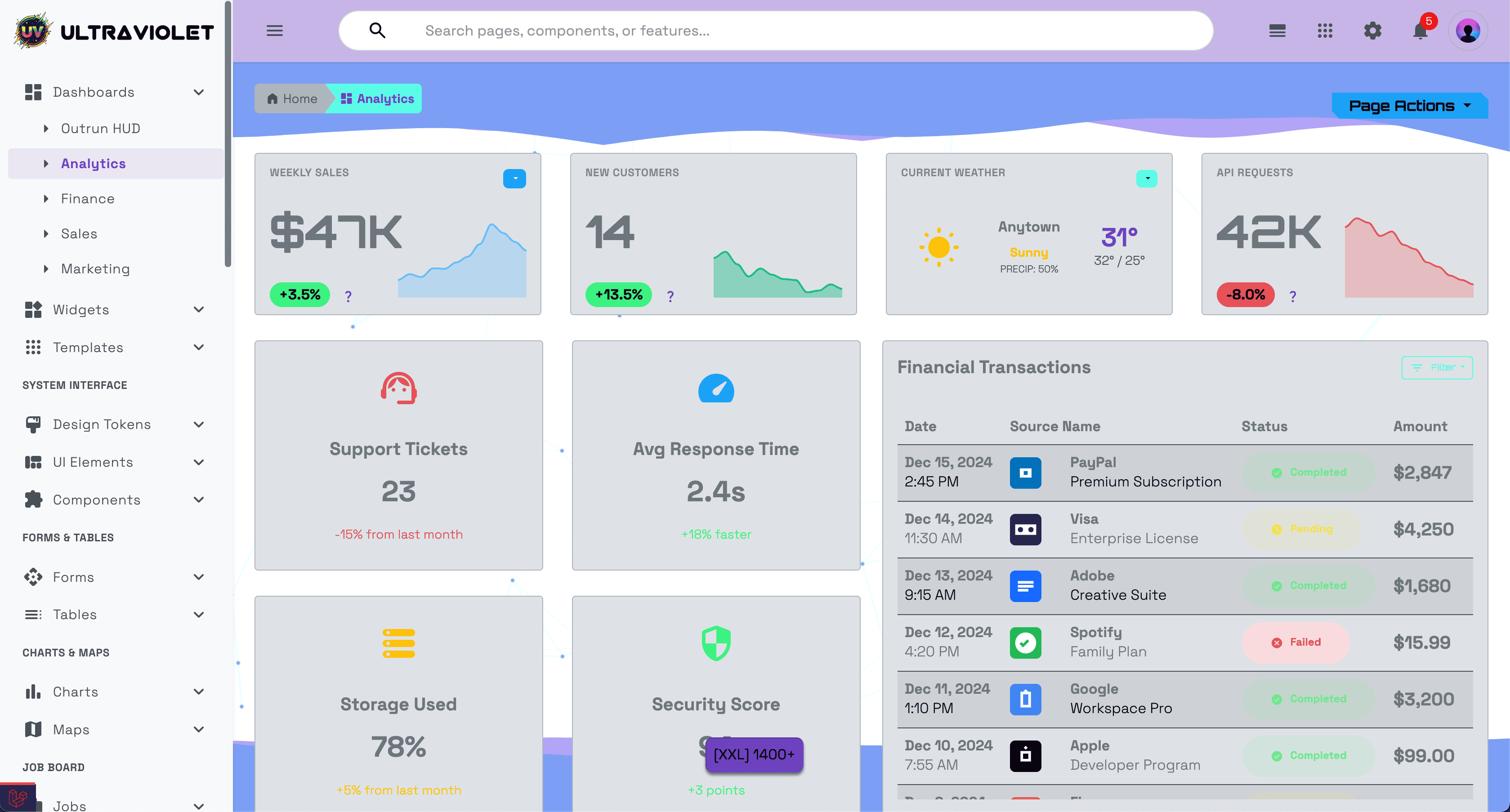
UltraViolet Pro in Light Mode - Professional light theme with optimized contrast
Activating Light Mode:
// Set light theme
document.documentElement.setAttribute('data-bs-theme', 'light');
localStorage.setItem('theme-preference', 'light');
Using the Theme Toggle
Users can switch themes using the settings panel:
- Click the gear icon (⚙️) in the top-right header
- Toggle the "Dark / Light Mode" switch
- Theme changes instantly and saves to localStorage
Programmatic Toggle:
function toggleTheme() {
    const currentTheme = document.documentElement.getAttribute('data-bs-theme');
    const newTheme = currentTheme === 'dark' ? 'light' : 'dark';

    document.documentElement.setAttribute('data-bs-theme', newTheme);
    localStorage.setItem('theme-preference', newTheme);
}
Theme Persistence
The selected theme is automatically saved to localStorage and restored on page load:
// Theme is restored on page load
const savedTheme = localStorage.getItem('theme-preference') || 'dark';
document.documentElement.setAttribute('data-bs-theme', savedTheme);
Direction Modes
UltraViolet Pro fully supports both LTR and RTL text directions for international applications.
LTR Mode (Left-to-Right)
Default mode for English and most Western languages.
Characteristics:
- Navigation on the left side
- Text flows left to right
- Menus expand to the right
- Standard Western layout conventions
RTL Mode (Right-to-Left)
Full support for Arabic, Hebrew, Persian, and other RTL languages.
Characteristics:
- Navigation on the right side
- Text flows right to left
- Menus expand to the left
- Mirrored layout for natural reading flow
Activating RTL Mode:
<!-- Add dir="rtl" to the html element -->
<html dir="rtl" lang="ar">
Programmatic Toggle:
function toggleDirection() {
    const currentDir = document.documentElement.getAttribute('dir') || 'ltr';
    const newDir = currentDir === 'ltr' ? 'rtl' : 'ltr';

    document.documentElement.setAttribute('dir', newDir);
    localStorage.setItem('text-direction', newDir);
}
RTL-Aware Components
All UltraViolet components are RTL-aware:
- Navigation menus automatically flip
- Dropdowns open in the correct direction
- Icons and arrows mirror appropriately
- Grid layouts reverse for natural flow
- Text alignment adjusts automatically
Testing RTL Mode
// Test RTL mode in browser console
document.documentElement.setAttribute('dir', 'rtl');

// Restore LTR mode
document.documentElement.setAttribute('dir', 'ltr');
Layout Modes
UltraViolet Pro offers two distinct navigation layouts.
Vertical Layout (Default)
Traditional sidebar navigation on the left (or right in RTL mode).
Route: /admin/dashboard (default layout)
Features:
- Sidebar navigation with collapsible sections
- More vertical screen space for content
- Ideal for applications with many menu items
- Supports nested submenus
- Collapsible sidebar for more workspace
Structure:
┌─────────┬──────────────────┐
│ Sidebar │   Main Content   │
│  Menu   │                  │
│         │                  │
│         │                  │
└─────────┴──────────────────┘
Accessing Vertical Layout:
<!-- In Laravel -->
<x-admin-layout>
    <!-- Uses vertical layout by default -->
</x-admin-layout>

<!-- Static HTML -->
<!-- Navigate to /exports/uv-vertical/ -->
Horizontal Layout
Top navigation bar with dropdown menus.
Route: /admin/dashboard?layout=horizontal
Features:
- Horizontal menu bar at the top
- More horizontal screen space
- Modern, streamlined appearance
- Ideal for applications with fewer menu items
- Better for wide-screen displays
Structure:
┌─────────────────────────────┐
│    Horizontal Menu Bar      │
├─────────────────────────────┤
│                             │
│       Main Content          │
│                             │
└─────────────────────────────┘
Accessing Horizontal Layout:
<!-- In Laravel -->
<x-admin-layout layout="horizontal">
    <!-- Uses horizontal layout -->
</x-admin-layout>

<!-- Static HTML -->
<!-- Navigate to /exports/uv-horizontal/ -->
Switching Between Layouts
// Switch layout programmatically
function switchLayout(layout) {
    // layout can be 'vertical' or 'horizontal'
    localStorage.setItem('preferred-layout', layout);

    // Redirect to appropriate layout
    if (layout === 'horizontal') {
        window.location.href = 'admin-dashboard.html';
    } else {
        window.location.href = 'admin-dashboard.html';
    }
}
Layout Comparison
| Feature | Vertical Layout | Horizontal Layout |
|---|---|---|
| Menu Position | Left/Right sidebar | Top bar |
| Content Width | Reduced by sidebar | Full width |
| Nested Menus | Multiple levels | Limited nesting |
| Best For | Many menu items | Few menu items |
| Screen Use | Better for tall screens | Better for wide screens |
Responsive Modes
UltraViolet Pro is fully responsive and adapts to all screen sizes using Bootstrap 5's breakpoint system.
Bootstrap Breakpoints
| Breakpoint | Code | Width | Device Type |
|---|---|---|---|
| Extra Small | xs |
< 576px | Mobile phones (portrait) |
| Small | sm |
≥ 576px | Mobile phones (landscape) |
| Medium | md |
≥ 768px | Tablets |
| Large | lg |
≥ 992px | Laptops/Desktops |
| Extra Large | xl |
≥ 1200px | Large desktops |
| Extra Extra Large | xxl |
≥ 1400px | Large monitors |
Mobile Mode (< 768px)
Characteristics:
- Collapsed sidebar/navigation
- Hamburger menu button
- Stacked layouts
- Touch-optimized controls
- Single-column content
Features:
- Mobile Menu: Hamburger icon opens slide-out navigation
- Responsive Tables: Horizontal scroll or card layout
- Touch-Friendly: Larger touch targets (44×44px minimum)
- Optimized Performance: Reduced animations and effects
Example:
<!-- Mobile-specific styling -->
<div class="d-block d-md-none">
    <!-- Only visible on mobile -->
    <button class="btn btn-primary" id="mobile-menu-toggle">
        <i class="material-symbols-rounded">menu</i>
    </button>
</div>
Tablet Mode (768px - 991px)
Characteristics:
- Compact sidebar
- Two-column layouts
- Optimized for touch and mouse
- Balanced spacing
Features:
- Adaptive Layout: Reduced margins and padding
- Flexible Grid: 2-3 columns depending on content
- Touch Support: Works with touch and mouse input
Example:
<!-- Tablet-specific columns -->
<div class="row">
    <div class="col-md-6 col-lg-4">
        <!-- 2 columns on tablet, 3 on desktop -->
    </div>
</div>
Desktop Mode (≥ 992px)
Characteristics:
- Full sidebar navigation
- Multi-column layouts
- Rich interactions
- Optimal spacing
Features:
- Full Navigation: Complete sidebar with all menu items
- Multi-Column Grids: 3-4 columns for efficient space use
- Hover Effects: Advanced hover interactions
- Keyboard Shortcuts: Full keyboard navigation
Example:
<!-- Desktop-specific layout -->
<div class="row">
    <div class="col-lg-3">Sidebar</div>
    <div class="col-lg-6">Main Content</div>
    <div class="col-lg-3">Right Panel</div>
</div>
Large Display Mode (≥ 1400px)
Characteristics:
- Wide layouts
- Maximum content visibility
- Enhanced sidebars
- More whitespace
Features:
- Wider Containers: Maximum 1320px container width
- Four Column Grids: Utilize full screen width
- Enhanced Spacing: More comfortable layout
Responsive Utilities
Display Classes
Control element visibility at different breakpoints:
<!-- Show only on mobile -->
<div class="d-block d-md-none">Mobile only</div>

<!-- Hide on mobile -->
<div class="d-none d-md-block">Desktop only</div>

<!-- Show on tablet and up -->
<div class="d-none d-md-block">Tablet and Desktop</div>

<!-- Show on desktop and up -->
<div class="d-none d-lg-block">Desktop only</div>
Responsive Spacing
<!-- Responsive margins -->
<div class="mb-3 mb-lg-5">
    <!-- 1rem margin on mobile, 3rem on desktop -->
</div>

<!-- Responsive padding -->
<div class="p-2 p-md-4 p-lg-5">
    <!-- Increases padding as screen size increases -->
</div>
Responsive Typography
<!-- Responsive font sizes -->
<h1 class="fs-3 fs-md-2 fs-lg-1">
    <!-- Smaller on mobile, larger on desktop -->
</h1>
Responsive Grid
<div class="row">
    <div class="col-12 col-sm-6 col-md-4 col-lg-3 col-xl-2">
        <!-- Responsive columns:
             - 1 column on mobile
             - 2 columns on small devices
             - 3 columns on tablets
             - 4 columns on laptops
             - 6 columns on large desktops -->
    </div>
</div>
Combining Modes
All modes can be combined for maximum flexibility:
Example 1: RTL + Dark Mode + Horizontal Layout
<html dir="rtl" data-bs-theme="dark">
    <body>
        <x-admin-layout layout="horizontal">
            <!-- RTL, dark theme, horizontal navigation -->
        </x-admin-layout>
    </body>
</html>
Example 2: LTR + Light Mode + Vertical Layout
<html dir="ltr" data-bs-theme="light">
    <body>
        <x-admin-layout layout="vertical">
            <!-- LTR, light theme, vertical navigation -->
        </x-admin-layout>
    </body>
</html>
Example 3: Responsive + Theme Auto-Detection
// Detect system theme preference
const prefersDark = window.matchMedia('(prefers-color-scheme: dark)').matches;
const theme = localStorage.getItem('theme-preference') || (prefersDark ? 'dark' : 'light');

document.documentElement.setAttribute('data-bs-theme', theme);

// Listen for system theme changes
window.matchMedia('(prefers-color-scheme: dark)').addEventListener('change', (e) => {
    if (!localStorage.getItem('theme-preference')) {
        document.documentElement.setAttribute('data-bs-theme', e.matches ? 'dark' : 'light');
    }
});
Testing Different Modes
Browser DevTools
Test Responsive Modes:
- Open Chrome DevTools (F12)
- Click the device toolbar icon (Ctrl+Shift+M)
- Select different devices or set custom dimensions
- Test all breakpoints
Test RTL Mode:
// In browser console
document.documentElement.setAttribute('dir', 'rtl');
Test Theme Modes:
// In browser console
document.documentElement.setAttribute('data-bs-theme', 'light');
document.documentElement.setAttribute('data-bs-theme', 'dark');
Testing Checklist
- [ ] Light mode displays correctly
- [ ] Dark mode displays correctly
- [ ] RTL mode mirrors layout properly
- [ ] LTR mode works as expected
- [ ] Horizontal layout functions correctly
- [ ] Vertical layout functions correctly
- [ ] Mobile menu opens/closes
- [ ] Tablet layout adapts properly
- [ ] Desktop layout utilizes space well
- [ ] All breakpoints transition smoothly
- [ ] Theme persists on page reload
- [ ] Layout preference saves correctly
Configuration
Default Settings
Set default modes in your application:
// config/app.js or similar

const appConfig = {
    // Default theme: 'dark' or 'light'
    defaultTheme: 'dark',

    // Default direction: 'ltr' or 'rtl'
    defaultDirection: 'ltr',

    // Default layout: 'vertical' or 'horizontal'
    defaultLayout: 'vertical',

    // Allow users to change theme
    allowThemeSwitch: true,

    // Allow users to change direction
    allowDirectionSwitch: true,

    // Allow users to change layout
    allowLayoutSwitch: true,

    // Respect system theme preference
    respectSystemTheme: true,
};
Laravel Configuration
// config/app.php

return [
    'theme' => [
        'default' => env('APP_THEME', 'dark'),
        'available' => ['dark', 'light'],
    ],

    'layout' => [
        'default' => env('APP_LAYOUT', 'vertical'),
        'available' => ['vertical', 'horizontal'],
    ],

    'locale' => [
        'default' => env('APP_LOCALE', 'en'),
        'direction' => env('TEXT_DIRECTION', 'ltr'),
    ],
];
User Preferences
Store user preferences in the database:
// User model
class User extends Authenticatable
{
    protected $fillable = [
        'name', 'email', 'password',
        'theme_preference',
        'layout_preference',
        'language',
    ];

    public function getThemeAttribute()
    {
        return $this->theme_preference ?? config('app.theme.default');
    }

    public function getLayoutAttribute()
    {
        return $this->layout_preference ?? config('app.layout.default');
    }
}
Performance Considerations
Lazy Loading
Load layout-specific assets only when needed:
// Load horizontal layout styles only when using horizontal layout
if (document.body.classList.contains('layout-horizontal')) {
    import('./styles/horizontal-layout.scss');
}
Responsive Images
Use responsive images for different screen sizes:
<img
    srcset="
        /images/logo-sm.png 576w,
        /images/logo-md.png 768w,
        /images/logo-lg.png 992w,
        /images/logo-xl.png 1200w
    "
    sizes="
        (max-width: 576px) 100vw,
        (max-width: 768px) 50vw,
        (max-width: 992px) 33vw,
        25vw
    "
    src="./images/logo-lg.png"
    alt="Logo"
>
CSS Optimization
// Use CSS custom properties for theme switching
// This is faster than loading separate CSS files
:root[data-bs-theme="dark"] {
    --body-bg: #0a1929;
    --text-color: #e7edf3;
}

:root[data-bs-theme="light"] {
    --body-bg: #ffffff;
    --text-color: #212529;
}
Accessibility
Theme Mode Accessibility
<!-- Announce theme changes to screen readers -->
<div role="status" aria-live="polite" class="sr-only" id="theme-announcement"></div>

<script>
function announceTheme(theme) {
    const announcement = document.getElementById('theme-announcement');
    announcement.textContent = `Theme changed to ${theme} mode`;
}
</script>
Keyboard Navigation
All modes support full keyboard navigation:
- Tab: Navigate through interactive elements
- Enter/Space: Activate buttons and links
- Escape: Close modals and menus
- Arrow Keys: Navigate through menus
High Contrast Mode
/* Support for Windows High Contrast Mode */
@media (prefers-contrast: high) {
    .btn {
        border: 2px solid;
    }

    .card {
        border: 2px solid;
    }
}
Browser Support
All display modes are supported in:
- ✅ Chrome (latest 2 versions)
- ✅ Firefox (latest 2 versions)
- ✅ Safari (latest 2 versions)
- ✅ Edge (latest 2 versions)
- ✅ Mobile Safari (iOS 12+)
- ✅ Chrome Mobile (Android 5+)
Fallbacks
For older browsers:
// Check for CSS custom property support
if (window.CSS && CSS.supports('color', 'var(--primary)')) {
    // Browser supports CSS custom properties
    initThemeSystem();
} else {
    // Fallback for older browsers
    document.body.classList.add('legacy-browser');
}
Troubleshooting
Theme Not Saving
// Check if localStorage is available
if (typeof Storage !== 'undefined') {
    localStorage.setItem('theme-preference', 'dark');
} else {
    console.warn('localStorage not available');
    // Use cookies as fallback
}
RTL Mode Issues
/* Ensure RTL support is enabled */
html[dir="rtl"] {
    direction: rtl;
    text-align: right;
}

/* Fix float issues */
html[dir="rtl"] .float-start {
    float: right !important;
}

html[dir="rtl"] .float-end {
    float: left !important;
}
Layout Not Switching
// Clear cached preferences
localStorage.removeItem('preferred-layout');
location.reload();
Responsive Issues
/* Ensure viewport meta tag is present */
<meta name="viewport" content="width=device-width, initial-scale=1">

/* Check for overflow issues */
html, body {
    overflow-x: hidden;
}
Best Practices
- Test All Combinations: Test theme + direction + layout combinations
- Save Preferences: Always save user preferences to localStorage or database
- Smooth Transitions: Use CSS transitions when switching modes
- Provide Toggles: Make it easy for users to switch modes
- Respect System Settings: Honor user's system theme preferences
- Accessibility First: Ensure all modes are accessible
- Performance: Optimize for fast mode switching
- Documentation: Document any custom modes you create
Related Documentation
- Theming Guide - Customize colors and styles
- Bootstrap Components - Bootstrap 5 components
- Responsive Design - Responsive utilities
- Static Setup - Using static HTML files
Support
Need help with display modes?
- Documentation: You're reading it!
- Email: support@huement.com
- Website: huement.com
Quick Reference:
// Switch theme
document.documentElement.setAttribute('data-bs-theme', 'light');

// Switch direction
document.documentElement.setAttribute('dir', 'rtl');

// Test responsive mode (in DevTools)
// Press Ctrl+Shift+M and select device

// Check current mode
console.log('Theme:', document.documentElement.getAttribute('data-bs-theme'));
console.log('Direction:', document.documentElement.getAttribute('dir'));
console.log('Viewport:', window.innerWidth + 'px');